
Knowing some basic color theory and doing your homework will help bring your brand to life.
Congratulations―you are about to launch (or relaunch) a product in a competitive category. It’s time to build your brand.
You have spent some serious time analyzing the market situation, gaining medical insights and developing a strategic launch plan. Now it’s time to turn your attention to the creative and visual aspects of building an effective brand―a brand that will stand out from the crowd.
![]()
Evaluate the palette of the marketplace
- Study the brand’s category/marketplace. Which specialty audience(s) is the key target for your brand? Cardiologists, neurologists, PCPs, nephrologists?
- Which other brands are competing for the HCPs’ attention. To help us in our research, we gather brand logos your target audience is being hit with day in and day out.
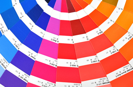
- Once we pull all the logos together, we take a broad look to see where the logo colors fall on the color wheel. Where do the logos start to blend? We analyze the colors, looking for trends. Do 90% of the logos use blue? Is orange the dominant color? Is there a brand that uses or owns a particular color in the category?
For example, if you were to bring a new GERD product to market targeting PCPs and gastroenterologists, you certainly wouldn’t want to compete with the “purple pill.” You would want your brand to stand out from the crowd. It should pop off the shelf in the sample closet and break through the clutter―in mailboxes, journals, print and digital collateral―that bombards HCPs every day.
Branding through color theory
Once you discover which colors on the color wheel are not being used excessively, you can select the colors that will differentiate your brand.
This is where we get into color theory, which can be a little complicated. Colors are subjective, and the emotional appeal of a color can change depending on your audience. Testing is a good way to confirm that your chosen color accurately reflects brand attributes and speaks to your target audience.
Seeing red in branding
Let’s look at the color red. Red is typically characterized as one of the most powerful colors on the color wheel; however, one person’s perception of red may vary greatly from another person’s. To understand how red is perceived, you need to consider who and where your target audience is located.
- Consider each specialty: red can mean healthy red blood cells to nephrologists, while it could represent aggravated inflammation to rheumatologists.
- In the US, red can symbolize some of our most powerful emotions―love (represented by red valentines, roses and hearts) and hate (when you’re so mad you’re seeing red).
- Digging deeper, ask yourself if your brand will be marketed only in the US, or will it also be marketed globally? Red can have a different color meaning across global markets. In parts of Asia, red indicates celebration and happiness; in Africa, red can mean death and mourning; and in the Middle East, red can represent good luck and good fortune.
Branding colors should reflect the desired position of your product in the market and be aligned with the brand promise. Once you establish the positioning and the brand promise, you will be able to make a solid recommendation on what your brand color should be. As with all elements of product branding, the color you choose must be consistent in all marketing materials.
Color will play a MAJOR role in building the life of your brand. At the end of the day, it is crucial to choose a color that will represent your brand effectively for long-term success.