
Optimizing your email for the usual assortment of desktop clients and factoring in the explosive growth in mobile email opens requires extra care.
Email programs are among the best ways for brand managers to keep a brand in front of customers. Although email programs may not be as “cool” as the latest social media outlets are, studies in recent years have shown that every dollar spent on email generated $30 to $40 in return. That is more than search advertising can claim, and more than the trendiest social media platform can hope to provide.
But email entails more than just composing and sending these days. Potential users can be turned away from your brand by emails that perform poorly due to today’s wide assortment of devices, screen sizes and gimmicks designed to engage desktop clients.
Standards? Sorry, we don’t have any.
Well, not in any official kind of way. Though the folks at email-standards.org do a fine job of keeping everyone up-to-date on what the latest email clients support, there is no governing body like the W3C to keep watch over the world of email.
To ensure that your email will be viewed extensively, you’ll need to consult an ever-changing list of CSS and HTML features supported by each individual email program. For most recent email programs—both mobile and desktop—media queries are supported. Take full advantage of this and treat your email with the same responsive touch you would give your web sites.
An ever-expanding base of screen sizes.
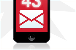
In addition to having a stunning lack of standards, the world you will be sending your email out into is filled with a constantly growing number of devices and screen sizes. Mobile email opens have exploded in recent months, with iOS devices making up over 35% of all opens.
Have you taken proper precautions to make your email’s message compelling, no matter the size or orientation?
Embrace the ability to create responsive email; it could mean the difference between success and failure with on-the-go users.
Your images are probably being blocked by default for your desktop users.
A great many of the currently available email programs block images by default. Be sure to write ALT tags for images meant to entice. These tags may generate interest among users who choose to display images on your email, or are adding a whitelist for future image display.
In a stroke of good luck, Apple’s enormously popular iOS platform displays all images by default.
Optimize your copy as well as your design.
The mobile device explosion should also allow you to stay focused on the effectiveness of your copy, as well as on your design and layout. The character limits for sender name and subject line on iOS and other mobile devices are around 35 characters for the sender name, and around 40 characters for the subject line.
Count your characters and maximize the impact of your subject line when viewed in a mobile new message alert.
As always, keep your main message concise and get the most important information into the top of the email.
Make an effort to reduce scroll fatigue for users by writing crisp, clear email copy, and work with your designer/developer to use progressive disclosure techniques to provide teasers and unveil larger blocks of content.
Make sure the design and copy team considers the readability of text and buttons in your mobile versions. Apple’s iOS has a minimum font size of 13 pixels and recommends a 44×44 pixel minimum button target area. These guidelines are vital for you to keep in mind when creating calls to action.
So, while you are thinking big with your branded email campaigns, don’t forget to also think small…small in terms of screens. Optimize your content for mobile, keep your templates responsive, and keep an eye on what the hot email programs can and can’t do. A few simple steps can help you continue maximizing your email ROI.


