6 campaigns that appeal to a diverse range of consumers

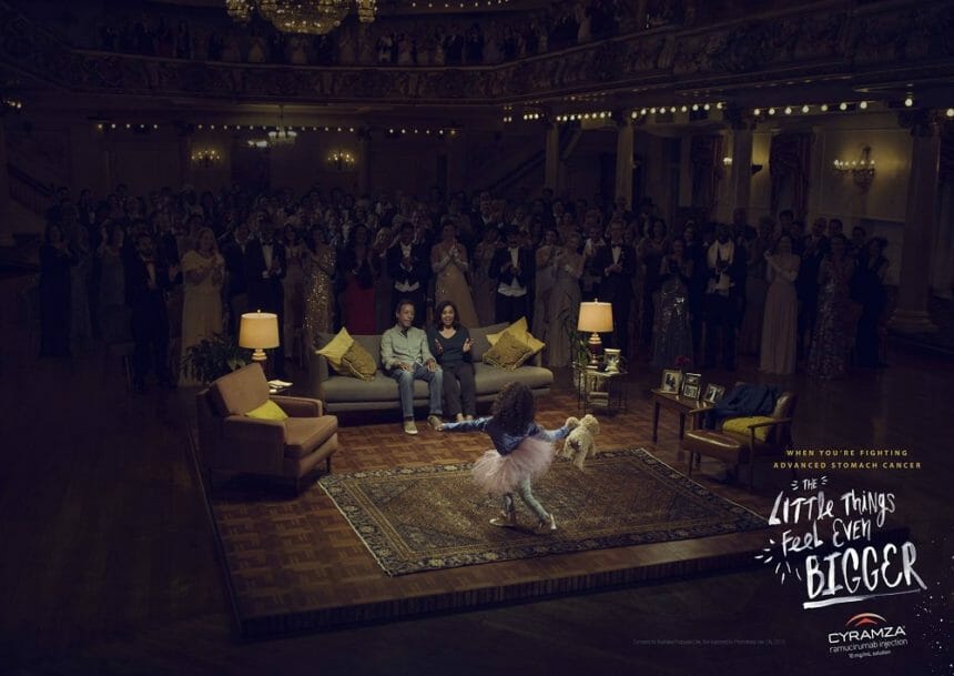
The Little Things Feel Even Bigger Cyramza Area 23
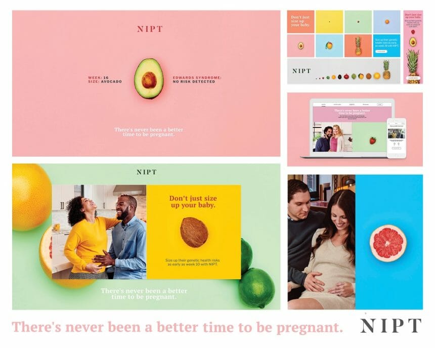
Theres Never Been a Better Time to Be Pregnant Illumina Inc NIPT The Bloc
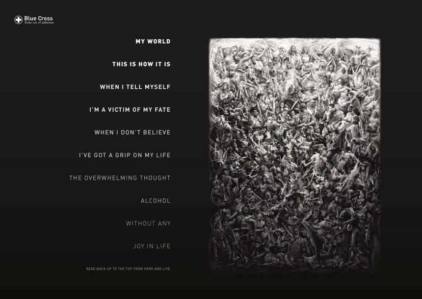
Reverse Poems Blue Cross Serviceplan
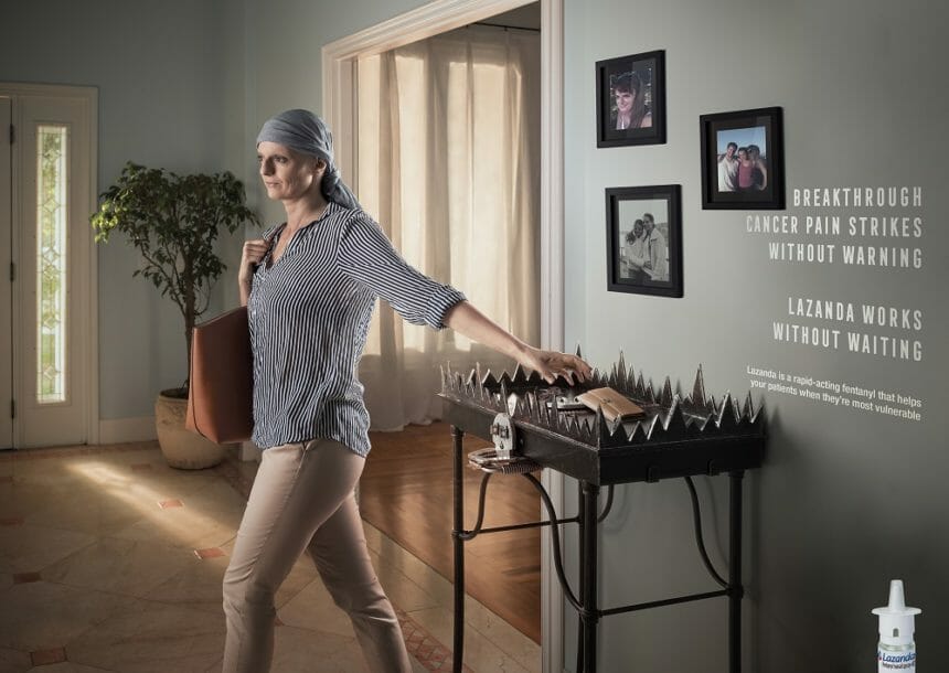
Without Warning Lazanda Area 23
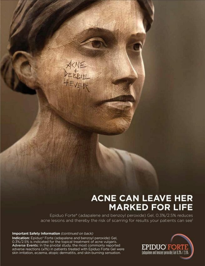
Marked for Life Epiduo Forte McCann
PBA Info Hand Print Website Avanir Pharmaceuticals AbelsonTaylor

Samantha Glasgow, Associate creative director, Purohit Navigation

At Purohit Navigation, and as an industry, we believe our HCP and patient audiences are becoming increasingly diverse, so our communications reflect this diversity. Our work needs to appeal to a broad range of ethnicities, ages and socioeconomic groups while engaging viewers with a three-second takeaway that is clean, concise and visually emotive. The six ads I selected display excellence in creativity and have strong imagery that evoke an emotional appeal.

The little things feel even bigger, Area 23

Appreciating the small things in life is something commonly mentioned by cancer patients. This ad emotionally communicates this idea, with well-executed photography and light treatment to highlight the diverse range of patients in everyday situations. The handwritten approach to the headline feels organic while communicating hope.

There’s never been a better time to be pregnant, The Bloc

The bright color palette, minimal copy, fresh application of typography and use of fruit in a metaphorical manner keeps this campaign engaging for the target audience. This combination of content and visuals, featuring a diverse range of happy, pregnant couples, tackles a serious issue in an uplifting way. It is successful in creating awareness of genetic testing to empower and reduce worry.

Blue Cross Addiction/Recovery, Serviceplan

Show-stopping visuals and copy work together to convey a duality of messaging. Read from the top down, the copy communicates the negative aspects of addiction. However, read from the bottom up, the copy conveys a positive message of recovery. The highly emotive and detailed visuals portray a cross-section of society showing the wide impact of addiction.

Without Warning, Area 23

The well-executed photographic style creates a sense of empathy on the part of the viewer and vividly conveys the challenge of breakthrough pain for patients. The typographical treatment allows the headlines to subtly blend with the background, reinforcing the overall message.

Marked for Life, McCann

This simple yet engaging ad conveys the negative impact of acne in a unique, clean and practical way. By portraying an acne patient as a wooden statue, the visual can represent any race, gender or age group. The engraving on the statue’s face imparts a sense of permanence and conveys emotional as well as physical scarring.

PBA Handprint, AbelsonTaylor

This campaign has a visceral approach, featuring extremely emotional patients representing different ages and racial groups. The handwritten message on their hands cleverly communicates the contradiction between the patients’ actual emotional state and their expressed emotional state.

1 of 7

6 campaigns that appeal to a diverse range of consumers

Samantha Glasgow is associate creative director at Purohit Navigation.

Slideshow

The Little Things Feel Even Bigger Cyramza Area 23
Theres Never Been a Better Time to Be Pregnant Illumina Inc NIPT The Bloc
Reverse Poems Blue Cross Serviceplan
Without Warning Lazanda Area 23
Marked for Life Epiduo Forte McCann
PBA Info Hand Print Website Avanir Pharmaceuticals AbelsonTaylor

Samantha Glasgow, Associate creative director, Purohit Navigation

At Purohit Navigation, and as an industry, we believe our HCP and patient audiences are becoming increasingly diverse, so our communications reflect this diversity. Our work needs to appeal to a broad range of ethnicities, ages and socioeconomic groups while engaging viewers with a three-second takeaway that is clean, concise and visually emotive. The six ads I selected display excellence in creativity and have strong imagery that evoke an emotional appeal.

The little things feel even bigger, Area 23

Appreciating the small things in life is something commonly mentioned by cancer patients. This ad emotionally communicates this idea, with well-executed photography and light treatment to highlight the diverse range of patients in everyday situations. The handwritten approach to the headline feels organic while communicating hope.

There’s never been a better time to be pregnant, The Bloc

The bright color palette, minimal copy, fresh application of typography and use of fruit in a metaphorical manner keeps this campaign engaging for the target audience. This combination of content and visuals, featuring a diverse range of happy, pregnant couples, tackles a serious issue in an uplifting way. It is successful in creating awareness of genetic testing to empower and reduce worry.

Blue Cross Addiction/Recovery, Serviceplan

Show-stopping visuals and copy work together to convey a duality of messaging. Read from the top down, the copy communicates the negative aspects of addiction. However, read from the bottom up, the copy conveys a positive message of recovery. The highly emotive and detailed visuals portray a cross-section of society showing the wide impact of addiction.

Without Warning, Area 23

The well-executed photographic style creates a sense of empathy on the part of the viewer and vividly conveys the challenge of breakthrough pain for patients. The typographical treatment allows the headlines to subtly blend with the background, reinforcing the overall message.

Marked for Life, McCann

This simple yet engaging ad conveys the negative impact of acne in a unique, clean and practical way. By portraying an acne patient as a wooden statue, the visual can represent any race, gender or age group. The engraving on the statue’s face imparts a sense of permanence and conveys emotional as well as physical scarring.

PBA Handprint, AbelsonTaylor

This campaign has a visceral approach, featuring extremely emotional patients representing different ages and racial groups. The handwritten message on their hands cleverly communicates the contradiction between the patients’ actual emotional state and their expressed emotional state.

1 of 7