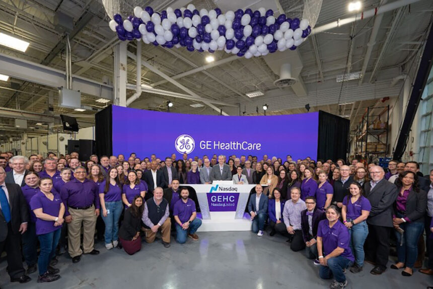
In November 2021, GE said it would split into three businesses: healthcare, aviation and energy, culminating in GE HealthCare making its trading debut in January.
The spinoff process included developing branding for the new company. To get a better sense of the brand strategy, PRWeek interviewed William Woduschegg, executive creative director of Interbrand New York, brand consultant for the new company.
How much of the branding was about distancing GE HealthCare from General Electric, given GE’s struggles in recent years?
Very much so. To hear leadership at GE HealthCare say, ‘It’s really all about patients and patient care and pushing forward this idea of access to healthcare and showing that we can do something around equity’ was just remarkable.
In a press release about the success of the rebranding, it mentioned the data used in developing the branding. Could you elaborate?
To incorporate the human lens into our analysis, we executed an extensive immersion and research plan to understand the potential ramifications from all stakeholder perspectives, both internal and external.
That included a survey of healthcare, aviation and energy customers and global employees. The research also included interviews with internal leaders, industry experts and investors, and an audit of competitor brands.
The goals were to learn more about current and desired perceptions of the GE brand; and the short-term and long-term financial implications of any rebranding, among other objectives, Woduschegg said.
The release also mentioned the use of “modern, open-source typography” in the branding. Can you talk about why you decided to use that?
Most important to us was that we use a type or a font that is readily available to everyone without going through all sorts of hoops. We wanted to make sure that we had something that’s absolutely inclusive.
What we love about using that typography is that it’s not just the Roman alphabet, but that we have languages from other regions. We had Cyrillic. There are Japanese fonts, and there are fonts for Mandarin and Korean.
We really wanted to make sure that we have something that is coherent and not that the key markets need to go through this entire exercise again.
Why was purple used in the imagery?
GE, as we all know, always had that industrial blue color, and we wanted to infuse warmth into that color, so we started to mix in some reds as we were exploring. And as we all know, when you mix blue with red, purple appears, and we liked very much this idea of not just going a completely different direction but using the legacy and the heritage of GE and mixing that with the warmth and compassion we are looking for.
What do you have planned for the next part of the rebranding?
We will be looking at further implementation across the globe, basically like absolute activation on anything and everything people will engage with, and there is a lot. That’s an ongoing, multiyear engagement to get everything to the level where we need it to be.
This article originally appeared on PRWeek US.
